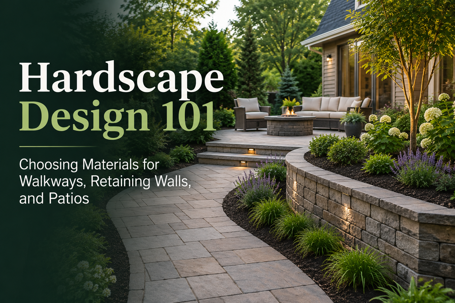
How To Use Before-And-After Landscape Visuals To Make Better Design Choices

Before-and-after landscape visuals do more than make a project look exciting. When used properly, they help you make better design decisions before you spend money on plants, hardscape, lighting, irrigation, or labor. They turn vague ideas into something you can actually judge. Instead of guessing whether a bed is too large, a patio is too close, or a planting scheme is too busy, you can see the change in context and make corrections early. Clear visual comparisons also reduce second-guessing because they show placement, spacing, proportions, and the overall layout more clearly than words or rough sketches alone.
A lot of landscape mistakes happen because people approve a design based only on what looks attractive at the moment. But the “prettier” option is not always the better one. A design may look clean in a static concept and still fail in real life because it ignores shade, circulation, mature plant size, maintenance load, or long-term comfort. Better decisions come from using before-and-after visuals to compare how the space will function, not just how it will photograph.
Why Before-And-After Visuals Matter So Much
Most people are not trained to read technical landscape plans. A flat drawing may make sense to a designer, but it often leaves homeowners, family members, and even some decision-makers unsure about what the finished space will actually feel like. That is why visual comparison matters. When a design is shown in a before-and-after format, the proposed changes become easier to understand at a glance. It becomes much easier to judge whether the design feels too empty, too crowded, too formal, too expensive-looking, or simply not suited to the property.
Before-and-after visuals are especially helpful because they place the proposed design in the real yard, not in an abstract plan view. That makes it easier to spot issues that are often missed early, such as awkward bed shapes, oversized features, blocked sightlines, or poor balance between softscape and hardscape. When you can see the concept in real context, the design becomes easier to critique honestly.
Start By Judging Function Before Style
The biggest mistake people make with before-and-after visuals is treating them as decoration instead of as a decision tool. The image should not only answer, “Does this look nice?” It should also answer, “Will this work well?” When you review a visual, start with function first:
- How will people move through space?
- Is there enough room around patios, paths, and entries?
- Does the design support how the yard will actually be used?
- Are sitting, entertaining, storage, privacy, and access needs being handled?
Good landscape planning starts with site evaluation, structure, intended use, budget, and conditions such as soil, light, topography, and microclimates. Plant choices and design details work better when they are based on those real conditions rather than on appearance alone.
Use The Visual To Check Scale And Proportion
One of the most useful things a before-and-after visual can do is reveal whether the design is the right size for the property. A feature can seem perfect on paper and look completely oversized once placed against the house, fence, or lawn. Use the comparison to ask:
- Is the patio too large for the yard?
- Are the planting beds too deep?
- Will the feature block windows or views?
- Is the entry area getting crowded?
- Are the trees too close to structures or too dominant for the front elevation?
Scaled placement is one of the clearest ways visuals reduce costly revisions. When a design clearly shows hardscape, planting, heights, spacing, and proportions, it becomes much easier to catch mistakes before installation starts.
Look At Spacing, Not Just Placement
A landscape can fail even when all the right elements are present. The problem is often spacing. Beds may be too tight. Trees may be too close together. Shrubs may be placed without enough room to mature. Walkways may feel squeezed by future growth.
A strong before-and-after visual helps you move past “where things go” and start evaluating “how much room they really need.” That matters because plant selection works best when it matches real site conditions, full size, design role, spread, and long-term performance. Height, width, light needs, soil preferences, and plant function should all influence the design from the start.
Compare Option A And Option B Before You Commit
One visual is helpful. Two visuals are usually much better. The smartest way to use before-and-after landscape visuals is to create more than one version of the same space. This lets you compare options side by side instead of getting emotionally attached to the first concept that looks polished. For example, you might compare:
- A lawn-heavy layout vs a planting-heavy layout
- A modern hardscape plan vs a softer garden-focused plan
- A low-maintenance option vs a higher-color option
- A privacy-focused design vs a more open design
- A phased budget-friendly plan vs a full upgrade plan
Comparing two concepts against practical factors such as comfort, upkeep, cost, and long-term performance usually leads to better decisions than simply choosing the design that looks most dramatic at first glance.
Use Visuals To Evaluate Maintenance Early
A design can look beautiful and still become frustrating within one season if the upkeep is too high. Before-and-after visuals should help you spot that early. Review the visual and ask:
- Does this design rely on too many high-maintenance beds?
- Will the edge lines be difficult to maintain?
- Are there too many disconnected planting pockets?
- Will pruning be constant once the plants mature?
- Does the design create irrigation inefficiencies?
Landscape planning works better when plants are grouped by real needs instead of by appearance alone. Grouping plants by irrigation requirement, for example, can reduce overwatering in some areas and underwatering in others. That makes the design easier to manage and more sustainable long term.
Judge Balance, Focal Points, And Visual Weight
A strong landscape does not only have good materials. It has visual balance. Before-and-after visuals are useful because they help you see how visual weight is distributed across the yard. One side may look too heavy. A front elevation may have too many competing focal points. A planting bed may be trying to do too much at once. When you review the visual, check for:
- A clear focal point near the entry or main view
- Balance between open space and planted space
- Enough repetition to make the design feel connected
- Enough variation to avoid looking flat or boring
- A sensible relationship between house, lawn, beds, and hardscape
This is often much harder to judge from a written description or a rough sketch. A before-and-after image makes imbalance easier to spot immediately.
Do Not Ignore Real Site Conditions
A good visual is only as good as the thinking behind it. If the concept ignores the actual site, the design can still fail after installation. A better review process checks whether the proposed changes make sense for:
- Light exposure
- Existing grade and drainage
- Soil conditions
- Mature plant size
- Access and circulation
- Wind and heat exposure
- Intended use of the space
Good design choices come from matching the landscape to real conditions, not from forcing a concept that only works in the image. Plants thrive best when their growing needs match the site. That principle should guide every visual decision you make.
Use Before-And-After Visuals To Reduce Revisions
One major benefit of before-and-after visuals is that they reduce unnecessary revisions. When people cannot picture the final result clearly, they often request repeated changes because they are still uncertain. But when the design is shown clearly in context, confidence improves and the approval process usually becomes smoother.
That matters for homeowners deciding between ideas, and it matters even more when a design also needs agreement from family members, contractors, or approval groups. Clear visuals make the change easier to understand at a glance, which helps move decisions forward with less back-and-forth.
How To Review A Before-And-After Landscape Visual Properly
A simple review method helps you get more value from each design image.
First, Look At The Big Picture
Ask whether the overall layout feels right for the home and the yard. Do not focus on plant types too early. Start with the shape of the design.
Second, Check Movement And Use
Look at pathways, sitting areas, entrances, and access points. Make sure the design supports daily use and not just appearance.
Third, Review Scale
Check the size of beds, trees, walls, patios, and focal features in relation to the home and available space.
Fourth, Study Maintenance Load
Think about trimming, watering, cleanup, seasonal refreshes, and how easy the design will be to manage after installation.
Fifth, Compare Long-Term Performance
Ask whether the design will still make sense after plants mature, seasons change, and the space is used regularly. This kind of review turns the visual into a practical planning tool instead of just a sales image.
iScape And Before-And-After Landscape Planning
iScape is useful in this process because it is built around visualizing a design before work begins. On its official site, iScape says users can design directly on a real photo of the yard or job site, upload their own images, and create 2D or 3D augmented reality designs to preview the finished result before digging. The platform also highlights features such as proposal tools, shareable visuals, and workflows that help users compare options, check scale, and present changes more clearly.
That makes iScape especially helpful when the goal is not just to create a nice-looking concept, but to make a better decision. You can use it to compare Option A and Option B, test whether a patio feels too large, see how a planting bed changes the front elevation, or share a clearer concept with others before money is committed. Because the design is shown in the real setting, it reduces the abstraction that often causes confusion in traditional planning. Download iScape on the App Store or Google Play Store today and start designing. Try a free trial today at iScape!
Common Mistakes To Avoid
Before-and-after visuals are powerful, but they can still be misused.
Avoid these mistakes:
- Choosing the design that looks flashiest instead of the one that works best
- Ignoring mature plant size
- Reviewing only one design option
- Forgetting maintenance and irrigation needs
- Using visuals that are not scaled clearly enough
- Focusing only on plants and ignoring circulation or structure
- Approving a design without checking real site conditions
A design image should help you think more clearly, not rush you into a decision. The best visual is the one that helps you ask better questions before installation starts.
Final Thoughts
Before-and-after landscape visuals are most useful when you treat them as a decision-making tool, not just a presentation tool. They help you compare options, judge scale, evaluate function, spot maintenance issues, and reduce revisions before money is spent. The best design choice is rarely the one that is only visually impressive. It is the one that fits the site, supports how the space will be used, and continues to work well after the project is built. Download iScape on the App Store or Google Play Store today and start designing today!